Productizing Zebra Technologies essential digital design system
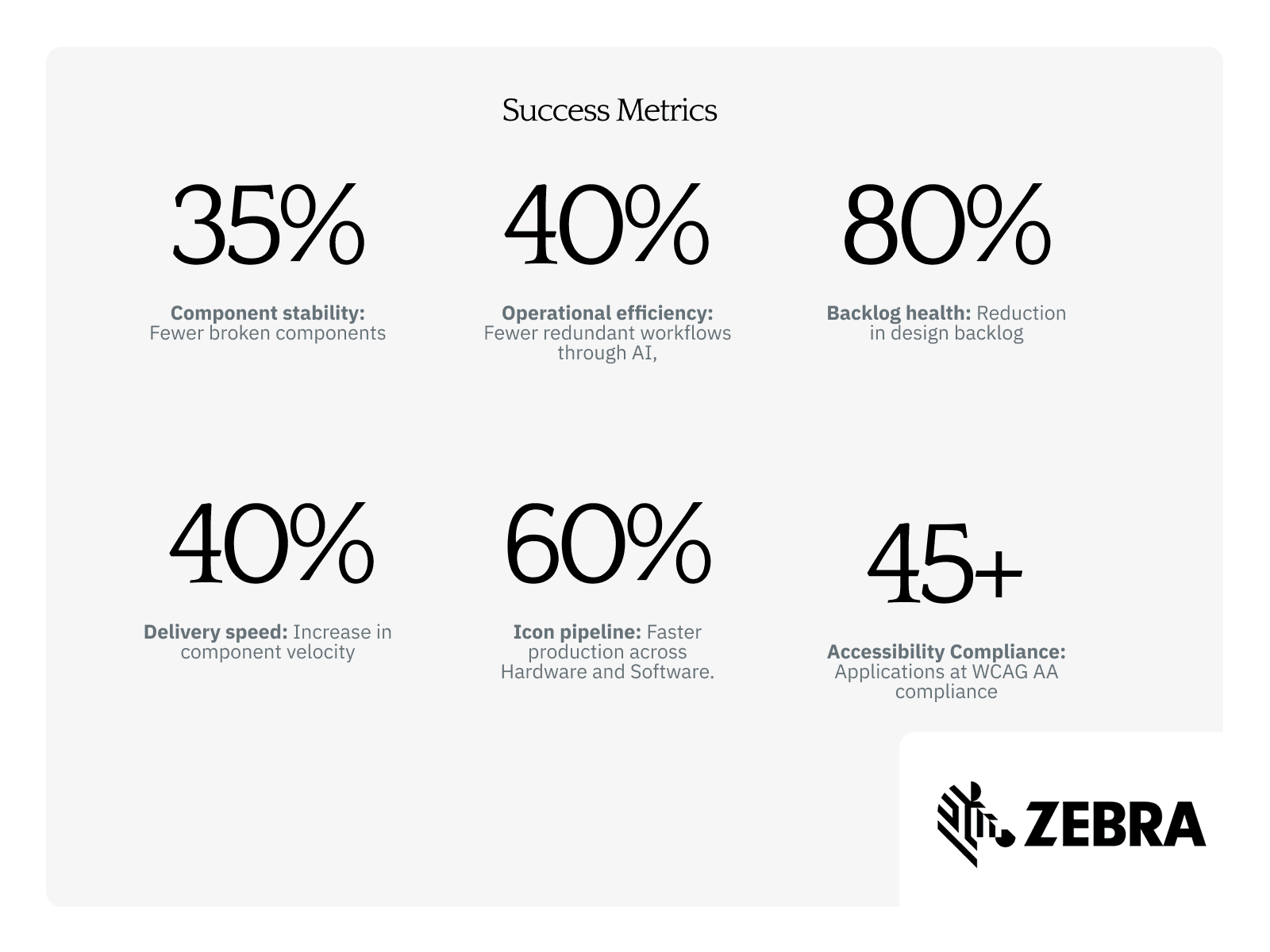
Zebra Technologies' design system was fragmented across shadow libraries, riddled with broken components, and largely ignored by the engineering teams it was meant to serve. I took ownership of the system and treated it like a product, implementing a roadmap, governance model, and AI-driven tooling. Over 13 months, the work eliminated 40% of redundant workflows, reduced component breakage by 35%, and accelerated icon production by 60%.
Client
Type
Year

Approach
Zebra Technologies builds the barcode scanners, mobile computers, and enterprise software powering warehouse floors, retail checkouts, and hospital environments worldwide. A coherent design system isn't a nice-to-have at this scale, it's operational infrastructure.
Role: Principal Product Designer, leading a team of 6 designers across 8 engineering teams, plus global hardware, brand, and marketing stakeholders. Partnered with an external agency.
Key constraints: Distributed engineering culture with entrenched team-specific conventions, no existing governance process, and a system that had eroded trust over time through inconsistency and outdated documentation.
The Problem
The system existed on paper. In practice, teams built around it. Shadow libraries had proliferated, designers modified components instead of using them as intended, and documentation was either outdated or missing entirely. A senior designer put it plainly: "I typically don't use the design system, but I would like to."
The risk wasn't just inefficiency. Without a shared foundation, design and engineering would continue to drift, compounding rework costs across Zebra's global product ecosystem.
“I typically don’t use the design system, but I would like to…”
Sr. Designer
Approach
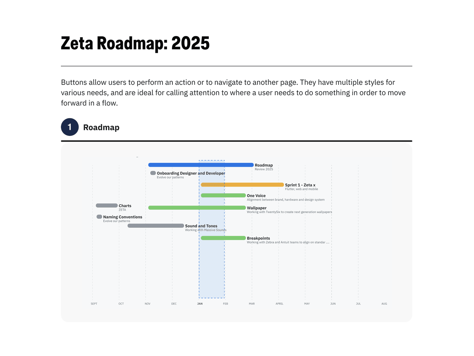
I didn't treat this as a cleanup project. I defined it as a product problem with real users, measurable outcomes, and a phased roadmap. Three strategic bets shaped the work:
Stabilize before scaling. No new components until the existing ones were audited, rationalized, and trustworthy.
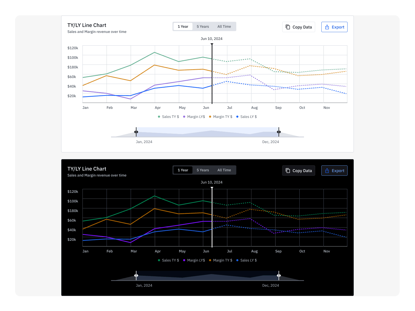
Close the design-to-code gap. Figma tokens connected directly to Storybook, with engineering reviews required before any merge.
Build adoption through capability, not mandate. Upskilling sessions and weekly critiques made the system something designers wanted to use.
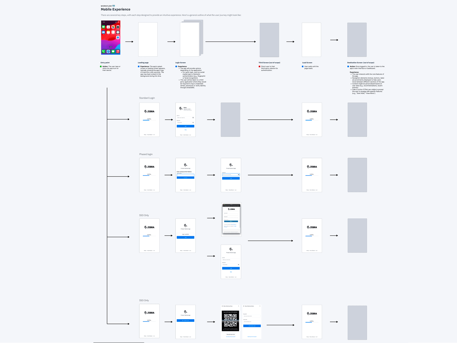
Process
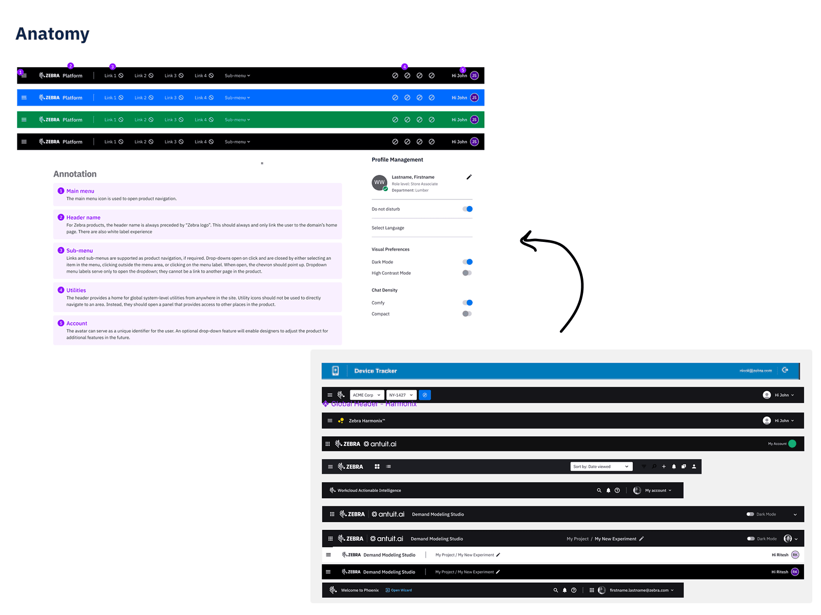
Audit with engineering. I ran a side-by-side review of every component, naming convention, and token with the engineering team. This surfaced which teams were using the system versus building workarounds, and established shared ownership from day one.
Figma branching workflow. Introduced branching so designers could iterate safely without corrupting core assets. A 48-hour review and merge cycle kept momentum without sacrificing quality.
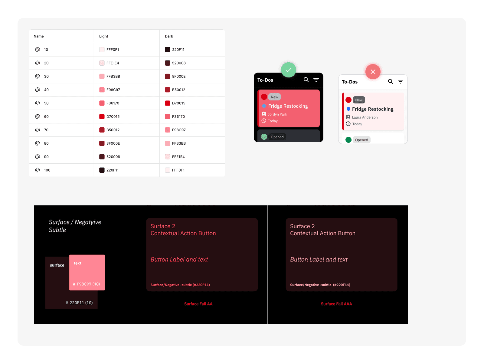
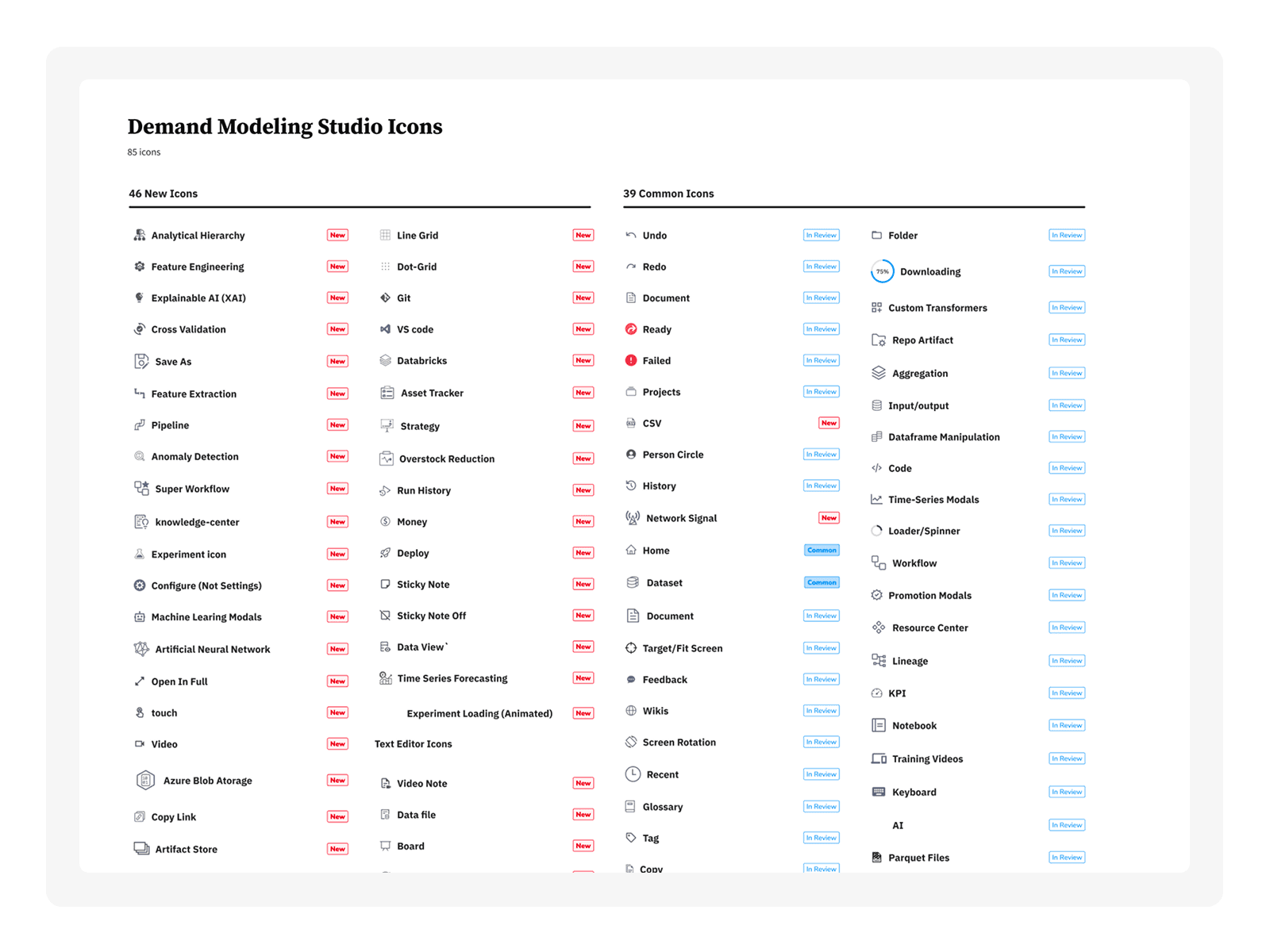
Icon system overhaul. Icon inconsistency affected roughly 75% of development teams. Physical device displays and companion apps weren't using the same assets. I led the effort to unify them, building an automated pipeline through Figma and Flutter, spanning design through implementation.
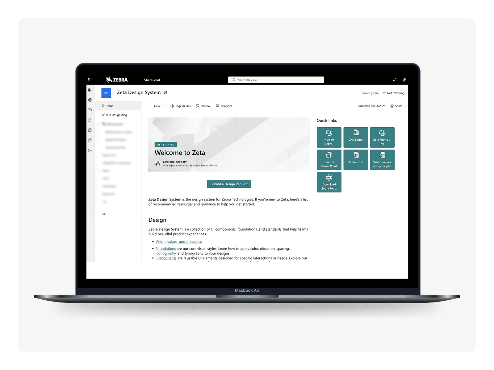
Centralized documentation hub. Consolidated all guidelines, specifications, accessibility standards, and templates into a single SharePoint hub. Paired it with a communication strategy: monthly update emails for PMs and engineers, a dedicated blog for designers.
AI integration. Identified repetitive bottlenecks in component audits, asset generation, and review steps. Integrated AI-driven tooling to eliminate manual overhead and redirect designer capacity toward higher-value work.
Solution
A fully governed, component-stable design system connected across design and engineering, with a centralized documentation hub, automated icon pipeline, and embedded AI tooling. The system moved from something teams worked around to something they relied on.
Reflection
The most important reframe was treating adoption as a design problem, not a compliance problem. Teams don't use systems they don't trust. Rebuilding that trust required working alongside engineers, upskilling designers without condescension, and making the system visibly better in ways people felt in their daily work.
If I were to do it again, I would have instrumented adoption metrics earlier. Qualitative signals were strong, but quantitative baselines from month one would have sharpened the story and accelerated executive buy-in.
This engagement shaped how I think about design infrastructure at scale: governance without culture is just overhead, and culture without governance is just good intentions.

